Here's why I turned down a brand-new iPad Pro
Being a tech journalist, you can imagine I often find flashy new gadgets crossing my desk, and most of the time I look forward to pulling them out of the box and seeing what they're like.
When my old editor left TechRadar a few weeks ago, and returned all his accumulated tech, he offered me the team's iPad Pro (2021) test sample. He knew that I still used my iPad Pro 12.9 (2018) daily, and presumed that I'd appreciate upgrading to the newer slate.
However, for one of the first times since I joined TechRadar, I said no. I declined this new, powerful, giant tablet, and said I'd prefer to stick to my older one.
This might seem like a baffling decision (and if there was a financial factor, it absolutely would be - these slates cost so much! But as a TechRadar device, it wouldn't be mine to keep). But after having used hundreds of gadgets in my time, and having kept a close eye on Apple, I had a few reasons for preferring the older tablet.
What does 'new' even bring?
With each successive generation of iPad, and particularly iPad Pro, one of the key upgrades touted is the new chipset. Each new device is meant to be more powerful than the last, and I don't doubt it.
But why should I care?
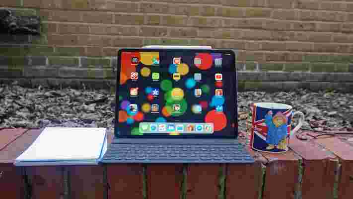
I use my current 2018 iPad Pro for some pretty high-end stuff - I use it for LumaFusion, which is a premium video editing app, and I do loads of gaming on it too (though my primary use is streaming and word processing).
That's just it, though, isn't it - if my older tablet can do everything a newer one would, what's the point of upgrading? I'd spend time transferring all my files, just for nothing. And it's not like speeds would be noticeably faster - I'm never having to wait ages for games to load, or for videos to render. More speed means nothing to me.
That's the same as with the other features Apple has brought to its newer iPad Pros. I'm in the 99% in saying I don't need a LiDAR camera, I can only see the benefit of a Mini LED screen when comparing one side-by-side with an LCD panel, and I think the Magic Keyboard looks daft.
Upgrading is a faff
Even if the 2021 iPad Pro isn't a big upgrade over the 2018 one, surely an upgrade would still be worth it (particularly since I'm not paying anything for it)? Well, not really.
I find the Apple device set-up process such a faff, it's enough to put me off from using them. I recently found this when I started using an iPhone for the first time in years .
Part of the reason is that I'm not totally on the Apple ecosystem, so I don't have a hundred device back-ups ready to send to the device so it knows all my apps and details. Instead I have to provide loads of information, and it takes ages.
Another part is a weird Apple issue that's affected me for years, ever since I first used my mum's hand-me-down iPhone (somewhere between 4-7, I can't remember which).
For some reason, my Apple ID is now partially linked to hers, so even though I have a separate account and apps and everything, I can still see her calendar and a few other things like this.
I've no idea why this is the case, and it mainly seems like recurring entries instead of new ones, but my Apple devices don't truly feel 'mine' while my mum's reminders are all populating the thing.
But perhaps change is in store?
I'm not saying I'm fully committed to my iPad Pro (2018), and I'm sure I'll upgrade at some point.
I haven't had the iPad since it launched four years ago, and have maybe used it for about two years, but it still hasn't aged fantastically.
Firstly, the battery life is terrible. It wasn't great to begin with, but even after a year of use the battery health deteriorated quickly, and now I can't do a few hours of writing without the percentage tanking.
Secondly, I got the device with the Keyboard Folio, and this thing didn't last long at all. It's meant to double as a case and a keyboard stand, but a few months in my bag ruined the appearance of the thing, and after about a year of owning the tablet the keyboard just stopped working. Now, it's a roughed-up-looking stand and nothing else.
This makes word processing in coffee shops really hard, as I have to touch the screen instead of typing like normal (and no, I'm not going to buy a new folio for a loaner device).
With these issues in mind, you should be able to tell how much I can't be bothered to deal with the whole upgrade process.
But I won't stick to this one forever. I'd like to try a smaller device, maybe like the new iPad Air 5 , though an iPad mini just sounds too small to be useful. I'd also consider an Android tablet - previously that'd be out of the question as LumaFusion doesn't run on them, but the big news from earlier in the year was that this app is actually coming to Samsung Galaxy tablets, and maybe more too.
So I'll wait for something to come along and pique my interest, instead of just waiting for whatever tablet falls across my desk - no matter how fancy (or expensive) it may be.
Android 13: everything we know and what we want to see, including beta details
The debut of Android 13 could be just around the corner - that's because Google IO 2022 is on May 11, and if history has taught us anything, it's that Google shows off its newest Android updates at this annual tech event.
The company is seemingly gearing up for this too, as we recently saw an Android 13 beta which gave us an early glimpse at the software, though we're hoping for a lot more from the final version.
This is the next version of the Google-built operating system after Android 12 , and it's destined to come to some Android phones towards the end of 2022, when we'll likely see a few smartphones come with it pre-installed too.
Since its debut in 2008, Android has always brought a major feature with every headline release. But with Android 13, codenamed Tiramisu, it could be a perfect time for Google to fine-tune what’s already there in the millions of Android smartphones around the world.
We’ve combed through our Pixel, OnePlus , and other Android phones to roundup five features we’d like to see arrive in Android 13 later this year, no matter how major or minor these may be.
But first, we’ll run you through when we expect it to land and which Android phones will likely be supported. We'll also look at the features we already know about, as the developer preview is out now, complete with a few Android 13 features.
Android 13 release date rumors
A new Android version usually appears for developers in February and indeed the first developer preview of Android 13 is now available , having launched on February 10, and a second preview has since followed.
These early releases give developers a heads up as to what should be appearing in the fall of that year, allowing them an idea of what they could implement for future versions of their apps.
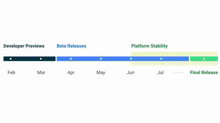
Google has also revealed an Android 13 roadmap which you can see above. From this you can see that the first proper beta might land in April, with a stable release in June, likely to coincide with Google I/O , which we now know kicks off on May 11, then a shipping date in September. Though October is possible too, as that's when Android 12 landed.
Android 13 supported phones
Android has a reputation for not making it easy to update your phone to the latest version. Part of it is due to the different manufacturers on how they have designed Android to match a brand, such as Samsung.
But with Google releasing a new Pixel phone every year, these usually come with the latest Android version. It wouldn’t be a surprise to see a Pixel 7 or a Pixel Fold appear with Android 13 in October again to start with.
The Google Pixel 6 and 6 Pro support the Android 13 beta, so they will almost definitely work with the finished software.
Other manufacturers usually follow after a few months of testing and putting their own spin on the new Android release, but it’s usually not until the first half of the next year.
Android 13 beta
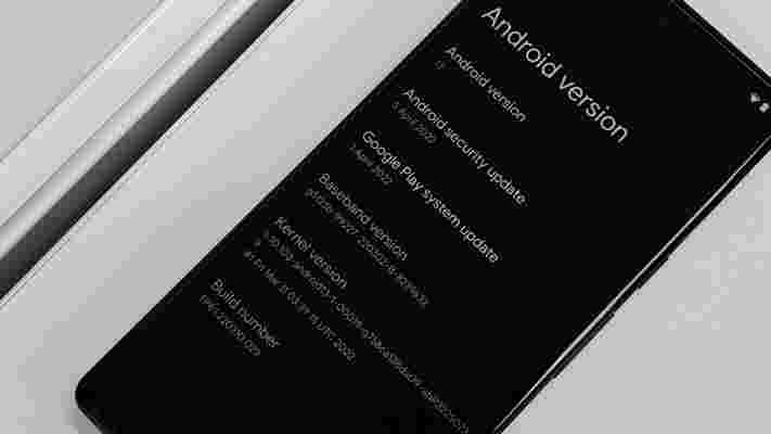
The first Android 13 public beta is here for Pixel 6 phones, and you can see if your device is eligible by going to the Android beta webpage.
There are some changes to Material You present here, but the biggest new feature we noticed is an increase in the number of permissions you have to grant apps.
If you're an average phone user, we wouldn't recommend downloading the Android 13 beta - the lengthy download time, and potential stability problems, mean it's probably best waiting for the final cut.
Android 13 features
We don't know much about what Android 13 will offer yet, but the first developer preview has revealed some features, with a second developer preview revealing more.
Eagle-eyed developers have recently spotted signs that Android 13 could support the use of two numbers (and two carriers) on a single eSIM at the same time – technology that Google patented back in 2020.
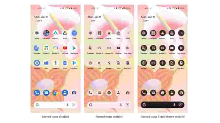
Meanwhile, Google's dynamic theming (which changes the color of icons to match your wallpaper) will now work with third-party app icons. This is just a Pixel feature for now, but with Google pushing to get other manufacturers to support dynamic theming it should eventually benefit most phones.
This release is also very focused on privacy, adding a photo picker feature that lets you share media such as photos with apps without granting them access to your entire media library.
Similarly, a new ‘Nearby device permission for Wi-Fi’ will allow apps to discover and connect to nearby devices over Wi-Fi without needing location permissions.
Plus, with Android 13 users will be able to set the default language on a per-app basis. So you could set one app to English and another to Spanish for example.
As for the second developer preview , that includes a new Foreground Services Task Manager for monitoring and closing apps that are running in the foreground.
It also includes the ability to dim wallpapers, redesigned media controls, and new user profile features, such as a profile picker button on the status bar, and a full screen profile switcher, which is likely designed for use with larger devices. Plus, the first time you open an app it will now have to ask your permission to send you notifications .
While not a confirmed feature, evidence of the ability to change the flashlight brightness has also been found in Android 13 code, though it looks like this might mostly be limited to phones that launch with Android 13 - not those that are updated to it.
Google has also revealed that it's working on app archivin g - a feature that would let you archive apps to free up around 60% of the space they take up, without fully deleting them. This would remove parts of them, but keep the icon on your phone and mean they can quickly be restored next time you come to use them.
The company hasn't confirmed that app archiving will come to Android 13, but has said it's arriving later this year, so Android 13 is likely.
What we want to see
Android 13 is still a little while away, so we've put together a list of the improvements we want to see from the next-gen software.
1. UI Fixes
While Material You showcases a new look for Android, it’s not without its faults. Some buttons are confusing users when a feature is enabled. For example, if you go to ‘Internet’ in the Notification Center, you have to press this icon again to toggle Mobile Data, Wi-Fi, and Hotspot. It feels convoluted, and there's no option to make these three options a separate toggle.
Alongside this, the colors in Android 12 lack contrast - everything looks pale compared to the vibrancy that iOS shows. But according to Android Police, it looks like Google is already aware of this, as new vibrant colors have seemingly leaked for Android 13.
Giving some saturated colors across the user interface could help the overall appearance of Android. However, the Material You design we're currently seeing is essentially version 1.0 of a new look for the operating system. iOS is still seeing refinements in its flat design since 2013, so we're going to see visual improvements in Android for years to come.
2. Scrolling Screenshots for all, not some apps
This feature was introduced for some apps in Android 12, where you could take a screenshot of a web page, but Android would stitch the content into one image.
However, while it’s a useful feature, it requires developers to include a ‘View-based UI’ in the app, otherwise scrolling screenshots isn’t an option for users.
Instead, Android 13 should make this available to all apps, regardless of the current requirement. Users shouldn’t need to check whether certain features in Android are also available to certain apps, and scrolling screenshots is one of them.
3. Release the backtap gesture
This first appeared in a beta version of Android 11 back in 2020 , before it was removed when the final release appeared for the Pixel 4 series and other smartphones.
There’s a variant already available on Apple’s iOS 15 , where you can customize a back-tap gesture on your iPhone, that could launch the Camera app or a shortcut for example.
It’s very useful for when you’re browsing another app, and you quickly want to switch to the camera app without going back to the home screen and finding its icon.
For Android, the backtap could be an easy win for users, especially as the software can be better customized compared to iOS. Imagine an Android 13 backtap where you can launch certain apps or media with a certain amount of taps, or the end result changes, depending on the app that you’re currently using.
4. Hand Off from iOS
According to Android Police , this may already be coming to Android 13, mirroring a feature where you can transfer what you’re listening to on your iPhone, to a HomePod speaker for example.
Tentatively called ‘TTT’ or Tap to Transfer, you can send the media you’re either watching or listening to, towards a device that could be in your home or workplace.
With a barrage of televisions running Android, alongside smart speakers, this could work well for sending across media in an easier way from your smartphone.
5. Please fix ‘Open by Default’ feature
Before Android 12, you could open a file and a message box would appear, asking you if you’d like to open this in an app just once, or from then on.
It was a simple message box but it solved a purpose. But with Android 12, an ‘Open with Default’ appears instead, ridding you of the choice of using an app once.
This change has been frustrating to users, as it requires you to go deep into the Settings app to make the filetype forget to open in a certain app. For Android 13, let’s revert it back to how it was. That’s all we ask.
New iPhone SE 2022 vs iPhone SE 2020: third time a charm for Apple's budget iPhone?
At Apple's March 8 Peek Performance event, the headliner was undoubtedly the announcement of the iPhone SE 2022 . So how does Apple's latest budget smartphone stack up to its hugely popular predecessor, the iPhone SE 2020 ?
We’ll need to spend some quality time with the iPhone SE 2022 before we can cast any definitive judgement here, but you can tell a lot from the spec sheet alone.
While they might look similar, there are some telling differences between the new iPhone SE and its second generation predecessor. Here's how the two compare.
iPhone SE 2022 vs iPhone SE 2020: price and availability
The iPhone SE 2022 starts at $429 / £419 / AU$719 for the 64GB model. The 128GB model costs $479 / £469 / AU$799, while the 256GB model costs $579 / £569 / AU$969. Pre-orders start Friday March 11, and it'll be available in stores from March 18.
The iPhone SE 2 hit shops on April 24, 2020. The 64GB model was priced at $399 / £419 / AU$749, moving up to $449 / £469 / AU$829 for 128GB and $549 / £569 / AU$999 for 256GB.
That represents a $30 bump for the new iPhone SE over the SE 2020, though it works out to the same price in the UK and AU$30 less in Australia.
iPhone SE 2022 vs iPhone SE 2020: design
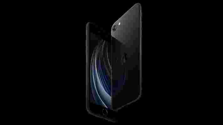
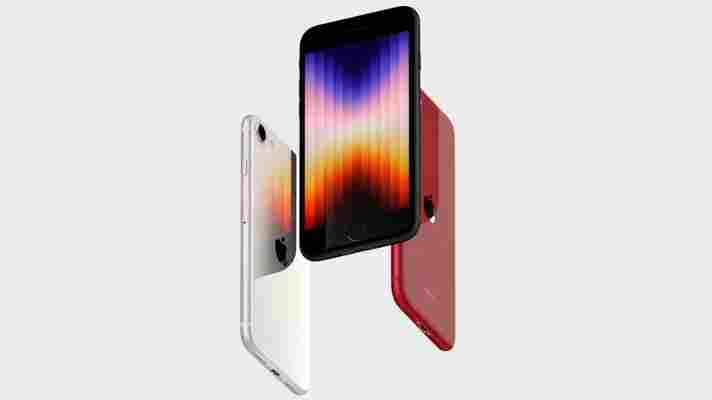
The iPhone SE 2022 essentially sticks with the exact same design as the iPhone SE 2020, which itself was based heavily on the iPhone 8 . That phone, in turn, took its basic shape from the iPhone 6 .
That means a familiar chunky forehead and chin, and the same fixed Touch ID sensor-cum-home button. The second-gen iPhone SE had a 65.4% screen-to-body ratio, which is likely to be the case with the iPhone SE 3 too.
It's a shame that Apple has stuck with this 7-and-a-half year old design for yet another year, but them's the breaks. Apple's advances lie in the area of performance, not design.
Like the iPhone SE 2020, the new phone is IP67-rated, which falls short of the flagship iPhone 13 series and its IP68 rating.
That's not to say that Apple has left the new iPhone SE's design entirely alone. It's coated the phone in the same super-tough glass that covers the back of the iPhone 13 family, both to the front and the back.
There are three colors to choose from at launch: Midnight, Starlight, and Product Red – essentially the same (or similar) black, white, and red shade selection as the iPhone SE 2.
We described the iPhone SE 2020 as feeling "classy in the hand", so it seems likely the iPhone SE 2022 will feel similarly nice, despite its dated design.
At 138.4 x 67.3 x 7.3mm, the new iPhone SE is identically proportioned to its predecessor. Interestingly, though, it's 4g lighter at 144g.
iPhone SE 2022 vs iPhone SE 2020: Display
There really doesn't appear to be anything to separate these two smartphone displays. Both are 4.7-inch LCD IPS screens, with 750 x 1334 resolutions for a pixel density of 326 ppi, and a 60Hz refresh rate.
The two phones also sport an identical maximum brightness of 625 nits.
We'll need to confirm this, of course, but it's almost certain that the iPhone SE 2022's display is exactly the same its predecessor, and the iPhone 8's before that.
None of which is very impressive by modern standards, even when compared to other similarly priced phones. Take the OnePlus Nord 2 , for example, with its 6.43-inch 1080 x 2400 AMOLED and 90Hz refresh rate.
iPhone SE 2022 vs iPhone SE 2020: Camera
Again, Apple hasn't gone into specifics on hardware, but it does call the iPhone SE 2022's single 12MP f/1.8 camera "an all-new camera system."
In terms of basic hardware, it looks identical to the iPhone SE 2020 camera. However, as we learned from the latter, Apple can make impressive strides forward with new processor technology and accompanying software tricks.
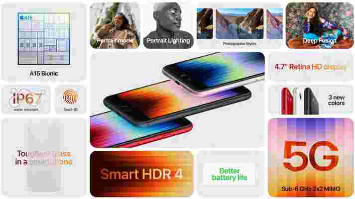
The new iPhone SE's camera system seems to be chiefly bolstered by the new A15 Bionic chip, which enables some of the key Neural Engine-driven camera features of the iPhone 13 range. That includes Deep Fusion, Smart HDR4, and Photographic Styles.
Apple also claims that the new SE features improved video quality, especially in low lighting conditions. Talking of which, both camera systems are capable of shooting video at 4K and 60fps.
It's a similar story around front, where both phones pack 7MP f/2.2 selfie cameras. Again, though, that A15 Bionic chip should make for superior selfies on the newer phone.
iPhone SE 2022 vs iPhone SE 2020: Specs and performance
Much of the new iPhone SE is similar to its predecessor, but there's one area where it takes a big step forward: performance.
Apple has packed its latest budget phone with the A15 Bionic processor, which is the same chip that drives the iPhone 13. By contrast, the iPhone SE 2020 runs on the A13 Bionic, which is the same chip that powers the iPhone 11 .
It's a two-generational leap in performance, then. Interestingly, Apple chose to compare the iPhone SE 2022's performance with the iPhone 8 rather than the SE 2. The A15 Bionic's CPU is 1.8 times faster than iPhone 8, while its GPU is 2.2 times faster.
Helpfully, it did the same thing when the SE 2 launched, revealing that the A13 Bionic CPU is 1.4 times faster than the iPhone 8, while its GPU is 2 times faster. At a very basic level, then, the new iPhone SE is significantly faster than the iPhone SE 2020.
The new phone’s 16-core Neural Engine, meanwhile, enables activities such as live text reading within the camera app. On-device Siri and dictation are also enabled on the newer device.
Another important advance for the iPhone SE 2022 is the provision of 5G network connectivity. This brings the SE line up to the same level of connectivity as Apple's mainline iPhone 13 range.
Both phones come with 64GB, 128GB, and 256GB storage options. We would have liked to have seen the 64GB option scrapped and 128GB becoming the new default, but never mind.
iPhone SE 2022 vs iPhone SE 2020: Battery
We don’t know the battery capacity of the iPhone SE 3 just yet, but it seems unlikely to be significantly larger than the iPhone SE 2’s 1821 mAh. Still, Apple managed to boost the capacity across the iPhone 13 family despite having identical designs to their iPhone 12 predecessors, so fingers crossed.
Especially given that the iPhone SE 2’s battery life was one of its key weaknesses. Light to moderate usage was really where the that phone was at its most comfortable, and we found that it would often give up before the end of the day.
Thankfully, Apple claims the iPhone SE 3 has better battery life, courtesy of its more efficient A15 Bionic chip in combination with the “latest-generation battery chemistry and tight integration with iOS 15”. That equates to a claimed 15 hours of video playback compared to the iPhone SE 2’s 13 hours.
The small print on the iPhone SE 3 press release claims that it can gain up to 50 percent of a charge in 30 minutes using a 20W adapter (not provided). Apple claimed the same for the iPhone SE 2 using an 18W charger, so it’ll be interesting to see if the capacity of the new phone has been bumped up at all.
Takeaway
Without having put the iPhone SE 3 through its paces, we can only draw limited conclusions. However, initial impressions point to an affordable iPhone that really hasn’t evolved all that much from its two-year-old predecessor.
Its design is nigh-on identical, if a little tougher, while its display is similarly unchanged. The camera system appears to be much the same, but we have experienced Apple’s impressive SoC-based improvements first hand with the iPhone SE 2.
Talking of SoCs, the iPhone SE 3 utilised the iPhone 13’s A15 Bionic chip, which is significantly faster than the iPhone SE 2’s A13 Bionic. That’s the big improvement here.
It’s a slightly disappointing evolution at first glance, but we’ll have to go hands-on to confirm whether Apple has made sufficient progress with its affordable smartphone line.