The Legend of Zelda: The Wind Waker HD review
In the original Wind Waker, there’s a moment early on we never quite understood. Just after Link dons his familiar green tunic, his friends and family all remark on how hot and uncomfortable he must be wearing so many clothes. Back in 2003, the climate on Link’s home island was certainly bright and sunny, but the GameCube’s flat lighting and general lack of shadows meant it rarely lived up to the idea of a tropical paradise.
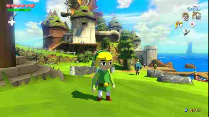
In The Wind Waker HD, it finally makes sense. Not only has the sun’s brightness has been dialled up to 11, but there’s a palpable heat in the morning sunshine. Thanks to a brand new lighting engine, light blooms on every surface it touches and everything from the smallest blade of grass to the tallest palm tree casts long, swaying shadows in the breeze. Even the clouds make their mark, gradually dimming the grass and sea as they move through the vast sky above. Skyward Sword may have had a painter’s touch, but The Wind Waker HD is a true work of art.

Wind Waker's cell-shaded graphics now look even more stunning in 1,080p
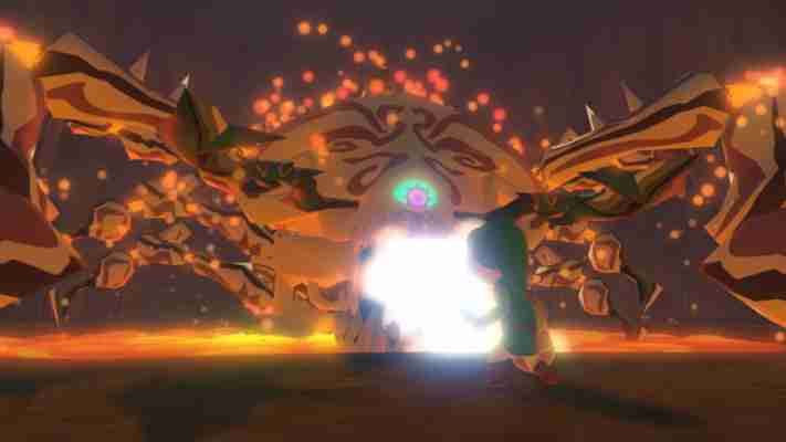
It's when the sun sinks below the horizon that impresses most, though, as your first infiltration of the gloomy Forsaken Fortress is quick to show. Moblins' eyes now glow with an eerie malice in the darkness, treasure chests burst open with a blaze of golden light, and the once lifeless anchors that hung silently from the rooftops now creak as their ominous silhouettes flicker across the stones in the moonlight. They're small details, but at 1,080p the world feels infinitely more alive because of them.
Even the Great Sea, which many complained was too empty in the original game, has been given a new lease of life. With the Wii U's added processing power, the horizon seems to extend much further than before, giving you a larger number of islands to catch your eye as you sail between destinations. Smaller islands may still be mere smudges in the distance, but larger land masses can be seen for miles dominating the skyline. We were a little disappointed to see so much pop-in still, but you'll only notice it when there are multiple enemies surrounding a particular island.

The new lighting engine makes a huge difference to the game's overall look
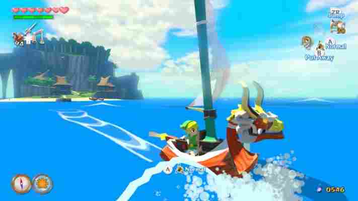
The newly added Swift Sail also halves the time you need to spend bobbing about on the ocean, as it not only doubles your speed, but it always gives you a favourable wind regardless of which direction you're facing so you don't have keep altering it manually with the Wind Waker. That said, you could almost go through the entire game without coming across it, as it's only mentioned once in passing by one of the Fishmen who fill in your map. Once you find it, though, you'll never want to turn it off.
It's a shame Nintendo didn't make any bigger alterations to the game, as we were hoping that the previously cut dungeons and islands revealed by Zelda producer Eiji Aonuma earlier this year might have been resurrected for this HD remake. Sadly, they're still nowhere to be seen, which leaves the weaker stretches of the game feeling even more lacklustre than usual. This is particularly evident during the extended sailing section to obtain the third pearl, which is simply given to you instead of being hidden away in a dungeon like the first and second pearls.

You can switch from your ordinary sail to the Swift Sail by tapping A
The Wind Waker HD isn’t so much a Director’s Cut, then, but that's not to say that the smaller changes are any less important. Minor tweaks include being able to aim your grappling hook, boomerang, bow and hookshot by simply moving your GamePad and the Deku Leaf now has a bright green leaf icon showing your location on the ground when you're gliding through the air. It's far more reliable than squinting at the screen to try and make out your tiny shadow, and aiming with the GamePad feels far more natural than trying to line up a shot with the analogue stick.
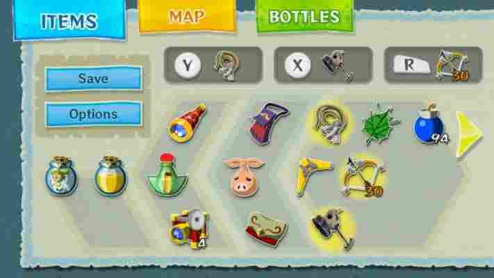
The Wind Waker HD has also benefitted from the lessons learned in Nintendo's Ocarina of Time remake for 3DS, as your map and inventory have both been moved to the GamePad's touchscreen instead of separate in-game menu screens. It's not hugely innovative, but we'd much rather be able to change weapons on the fly than have to constantly break up the action with static menu screens. The real boon comes when you're tracking down treasure chests. Instead of diving into the menu screen every time you want to check your position, all the information you need is right there on the GamePad, saving you a lot of time and hassle if you accidentally overshoot your mark.

Pausing the game mid-fight is a thing of the past with your touchscreen inventory
Players get a bigger wallet at the start, too, so you can get your Triforce Charts deciphered by Tingle in the latter half of the game without having to seek out the Great Fairy fountains to widen your purse strings. The Triforce quest has also been streamlined, as you now only need to decipher three charts instead of eight. The rest of them have been replaced with proper Triforce chunks at the end of each island trial, which we think are far more fitting rewards than anticlimactic bits of paper.
All this might sound like one concession after another to placate less attentive players, but what emerges from this series of time-cutting exercises is a leaner, more action-packed game that's better for it. The Wind Waker is already one of the shortest (and easiest) Zelda games in the series, but Nintendo has been very careful to make sure these modifications haven't lessened the game's overall challenge. In fact, the inclusion of a new, harder Hero Mode that's available right from the start of the game shows that every effort's been made to please both returning players and those who want a bit more of a challenge.
The Wind Waker HD has shadows and lighting the GameCube could only dream of
The only real disappointment comes from the somewhat patchy soundtrack. The music's clearly been re-mastered since the days of the GameCube, with proper orchestral instruments replacing the synthesised bloops of the original, but all too often it seemed to slip back into its old habits, making it difficult to tell the difference between the two scores. It's also disappointingly conservative, sticking as closely to its original source material as possible instead of bolstering each track with more instruments. Once you've heard a live full-piece orchestra belt out the Great Sea theme, anything else sounds disappointing by comparison, and The Wind Waker HD's soundtrack leaves a lot to be desired after the heavily-orchestral Skyward Sword.
That said, The Wind Waker still has buckets of charm and its weathered the intervening decade far better than other HD remakes. In your mind's eye, this is how Wind Waker's always looked, but seeing it on a big screen is something else entirely. Veteran sailors may want to wait awhile before dipping their toes back into this watery version of Hyrule, but if this is your first time venturing out on the Great Sea, The Wind Waker HD is a must-buy for your Wii U library.
Details | |
|---|---|
| Price | £40 |
| Details | www.nintendo.com |
| Rating | ***** |